I’ve been enjoying playing Phasmophobia with friends and watching others play solo games on Twitch. I decided to produce a couple of to-scale map/level designs inspired by this—one entirely new map and one reimagining of an existing map.
The Game
The premise is that you are a ghost detective, using equipment to work out what type of ghost is present and where exactly it’s lurking. The ghost is able to ‘hunt’ and kill the player if certain criteria are met. The player wins if they survive and identify the ghost but lose if killed.
There are presently 10 maps in Phasmophobia (6 small, 3 medium, 1 large) that the player can select from at any difficulty level. There are ~20 ghost types, all with different patterns of behaviour. The ghost type and its location within the map are randomised when the map is loaded (and the ghost can change location mid-mission on higher difficulty settings).
Most maps include safe hiding spots (such as lockers), less safe hiding spots (behind furniture), and breakers for turning the power on/off. A ghost that is chasing a player will slow down when it loses line of sight on their target but will find a player in their hiding place if they see them go into hiding.
Design 1: The Asylum
The Asylum is an existing map in Phasmophobia and is the largest map available. This is a reimagining of that map and draws heavily from the original.
This redesign was inspired by discussion in the Phasmophobia community about whether or not the Asylum level is too big—many players seem to find it too difficult to locate the ghost and too difficult to survive long enough to win (as the ghost becomes more aggressive the longer is spent in game) however others enjoy the challenge it presents.
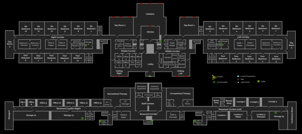
I wondered if changing the layout, rather than reducing the overall map size, might change the player experience for those who find it overwhelming while still preserving the challenge for others. It struck me that the original map comprises two very long and thin floors, which necessitates a lot of long walks while fetching/carrying equipment, and is quite repetitive, which makes the exploration/traversal both more disorientating and more tedious.
The original map:

My proposed solution is to essentially remove the two long wings from the building and instead ‘stack’ the same amount of floorspace over four floors with smaller footprints.
My redesign:


Key points:
- Same size map, split over 4 floors
- A smaller footprint for improved navigability
- Bigger variety of spaces
- More internal windows
- Groundwork for stronger visual cues
- Potential for efficient flexibility in playable area
The ground (entry level) floor of this redesign is very similar to the central section of the original ground floor, but stairwells replace the entrances to the wings. I also tweaked the layout to break up the spaces for variety and reassigned rooms to reflect my experience of real hospital layouts (gained through surveying work in an actual hospital). Thematically the ground floor is the active part of the asylum with dining, treatment, and visitor areas. I introduced more internal windows in locations where these made sense so that players might be able to catch glimpses of ghosts or ghost activity.
The basement level still has a long profile but it’s much shorter than the original, contains fewer rooms with more distinct themes (thematically the basement is a ‘staff only’ level), and has a layout that allows more circular routes which may help players escape hunting ghosts. Once again, windows have been introduced where appropriate.
The first and second floors have identical footprints for internal consistency and are both focused on accommodation spaces, though they contain other rooms too. Despite this, they have very different layouts, which is to aid navigation and to provide variety. While Phasmophobia randomises the breaker location, I think it might be worth having a second one always available on the top floor (as well as somewhere on the lower floors) because traversing the whole building to turn the power back on is frustrating.
A key visual element that I propose with this redesign is that the walls of the different floors/areas be strongly colour-coded for quick identification of player location—a tactic that is frequently used in real hospitals.
This stacked redesign also provides the opportunity for a built-in mechanic to vary the map’s size as per the player’s ad-hoc preferences if we place doors at the bottom of the stairs leading up from the ground floor. The doors would be locked when the level loads and the ghost confined to the two ‘open’ lower floors (effectively making it a medium-size map). Players would be prompted to unlock the doors using a button in the nursing station close to the front door if they want a bigger challenge, and doing so would trigger a refreshed ghost location so that it might be anywhere in the building. This option could be easily signposted by the usual ‘Welcome to the map’ radio voiceover that greets players when a map loads in; perhaps they could say something along the lines of “This is a big building. We’ve had reports that the ghost is on the lower floors but if you want to check the whole building you can unlock the upper stairs from the nurses’ station in the lobby.” This might enable the map to appeal to a wider variety of players without functionally changing the map itself.
Design 2: The Ghost Train
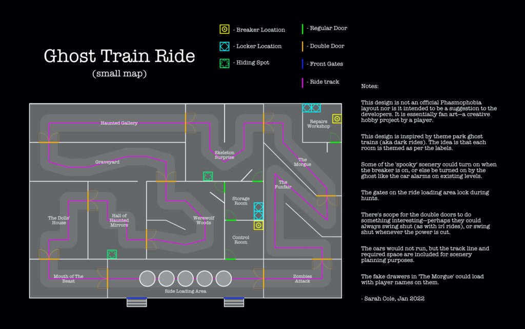
This is an original design for a small map, inspired by a fairground ghost train or dark ride.
These types of rides are interesting in the way that they maximise a smallish space with lots of dividing walls and switchbacks. I also thought it could be fun to have various elements of the spooky scenery be active when the power is on, or perhaps activated by the ghost. There’s also scope for the double doors to do something dynamic—to always swing shut, to open/shut when the power cuts, or something in this vein.

When producing this map design I was keen to make it a plausible layout for a dark ride as well as being playable. I gave thought to lines of sight for ghosts in pursuit, where players might be able to hide or lose their pursuer, and ways to make an otherwise one-way system into a map more traversable. I also thought that distinct themes for each of the ‘rooms’ would improve navigability as well as making the space more atmospheric.
I’m pretty happy with this design, though it would require a build and playtesting to see how well it works in actuality. I only made minor tweaks to the layout between the original design and this version.
I may white box this layout in Unity (as it’s the engine Phasmophobia is built in) to test it at some point in the near future.